Week 1: 1/16/24
Syllabus & Expectations
Syllabus & Expectations
Instructor
Philip DiBello
philip@noideas.biz
Course Description
This course will provide an emphasis on developing your sensitivity to typography. We will discuss when and why certain typographic choices feel relevant and how they are employed in your design. This will be accomplished by both restrictive and open-ended assignments. Projects will be a combination of experimentation and formal exercises with a focus on typographic systems. Together we will discover the details of macro and micro typography.
Central discussion themes include theory, dialogue, process and personal practice. The goal is to inform your personal opinion about design. Classes are a combination of critique, in-class workshops, and one-on-one meetings with occasional guest lectures and critiques.
Throughout the semester readings will be assigned along with each project. They are central to your comprehension of the task at hand. Read them carefully and do your best to challenge the thoughts written within the essay.
Student Expectations
This course assumes you already have knowledge of fundamental design and typographic principals. Some assignments will be open ended. You must take initiative in every project and make it your own. You’re expected to engage in critique, both by giving and receiving feedback.
Your level of effort will dictate your success in this class. You must be disciplined and self-motivated. To get good work here (or anywhere) you must put in the time and effort. This is a space to discuss graphic design in it’s purest form. You’re here for yourself. Not to please your peers, or your professors, or other outside sources. In this classroom we will intentionally subvert “real world” concerns.
Know there will be general costs required for materials such as paper and color prints as well as hand tools like knives, blades and rulers. Craft is a critical component to your assignments, understand that frayed, crumpled, ripped and uneven work is not acceptable.
Attendance is critically important to the success of your assignments and your letter grade. You’re required to be in class at it’s start time. Once you walk into the classroom please display your work before you do anything else. It should be hung on the wall, uploaded to the class computer, or set on a table and prepped for presentation. Take pride in your work and display it properly, hang things straight and in an orderly grid, etc.
Attendance Policy
At SVA the individual faculty member determines the number of acceptable absences, if any. My policy is as follows: you’re given one absence without repercussion. Missing a second class is an automatic C. If you miss three classes you will be withdrawn from the course, no exceptions. Tardiness will not be tolerated. Class starts promptly at 3:20, and the classroom door will be closed at 3:30. If the door is closed you are not permitted to enter and your tardiness will be counted as an absence.
Class Schedule & Critique
Critique’s are our way of helping you improve your work. It is an exercise in explaining your ideas and understanding how others react to what you’ve made. Critique’s are only successful if you are willing to participate. If you feel there is not enough room to speak your mind, please make it known. If you are struggling with critique, read the following explanation. Thank you Mitch Goldstein, Lauren McCarthy, Sasha Portis and Sophie Auger for influencing this style of critiques.
3:20-3:30
Attendance. Hang, display or upload work
3:30-3:50
Review assignment next steps and materials
3:50-4:10
reading review (if applicable)
4:10-6:00
Critique and project review
6:00-6:10
Reset room
Grading Breakdown
Grades are a combination of the quality of your work, class participation and progress. Simply showing up will not make you pass the course. You must be prepared for the days lesson, completing any homework or readings assigned and ready to discuss. Completing all assigments and readings awards you a C. Your course grade includes attendance and participation (40%), reading discussions (10%), and assignments (50%). Participation considers critiques and the ability to speak to your work. Reading discussion means you actively read the reading in question and shared your point of view in the discussion. Assignment completion considers you delivering a final project, and my review of how successful the project was from a formal, conceptual and technical (digital / physical craft) standpoint.
Work
3 — Your work is of exceptional quality and reflects mastery of the material covered in class. Your craft is impeccable and you find ways to push design and materiality. You consistently add something new to every project or push your capabilities. Your work steadily improved throughout the semester.
2 — Your work is very good and satisfies the goals of the course. Continue to refine your craft, and find those moments to take initiative in any given project and push it beyond it’s boundaries.
1 — Your work meets the standards of the course. Be willing to take more chances with craft and production. You turn in assignments and did not miss more than one class.
0 — Your work did not meet the requirements for this class. You did not complete all projects or missed 3 classes. You will receive no credit.
Participation
3 — Your class participation is outstanding, you frequently speak your mind and provide feedback on others work. You are willing to provide insight into your design decisions and receive feedback. You come to class on time, prepared with craft intact and immediately hang your work at the beginning of class. When we discuss readings, you share thoughts and highlights.
2 — You could speak up or engage more often during class discussion. You’re willing to speak your mind when called on. You are brief in your project description and could provide more insight to the group. Consider writing this down beforehand so you are’nt put on the spot. You infrequently share thoughts on readings, if at all.
1 — You do not participate in class discussion. You spend most of the critique unengaged unless we’re talking about your work. You’re often the last to hang your work, or late. You do not discuss readings.
0 — You missed two or three classes and will receive no credit.
Total
6 = A+
5 = A
4 = B+
3 = B
2 = C+
1 = C
0 = F
Academic Integrity
Academic dishonesty, including plagiarism, will not be tolerated. Students found to have committed an act of academic dishonesty will fail the assignment for which an infraction is suspected and substantiated. More serious violations will be handled through the process enumerated in the SVA Handbook. Put simply, make sure your work is your own.
Students with Disabilities
SVA is committed to providing students with access to their academic programs and courses. If you are a student with a disability and require accommodations, you must register with Disability Resources by visiting sva.edu/disabilityresources and completing an online accommodation request. To be eligible for accommodations in this course, students must provide the instructor with a letter of accommodation from Disability Resources. For questions or assistance, please call Disability Resources at 212-592-2396, or visit the office: 340 East 24th Street, New York, NY 10010, or email disabilityservices@sva.edu
Pronouns and Chosen Names
Students may indicate their pronouns and preferred/chosen first name through MyServices; this information will then appear on class rosters (go to "Edit Personal Identity").
Please let me know the preferred name and pronouns by which you would like to be referred, if that information does not already appear on the roster. A student’s chosen name and pronouns should be respected at all times.
AI Position and Policy
SVA has a position on AI which you can read below. In this class AI can be used freely as a tool, to build and concept with. At no point should you pass AI work as your own. But as a designer, you have the ability to use AI as a very powerful starting point. Please make sure your work is your own thoughts and ideas that you may express freely.
Artificial intelligence image and text generators are poised to significantly impact all creative industries. As design and advertising educators, it is our goal to provide students with the knowledge, strategies, and skills necessary to compete and excel in their chosen fields today and in the future. In this spirit, the BFA Design and BFA Advertising department has outlined its first AI policy which recognizes that AI will be an important and ever-evolving tool for students and professionals alike while also reinforcing the importance of transparency, accountability, and creativity.
This policy is an ongoing and evolving document and will be updated and revised regularly in response to changes in technologies, culture, and art. All work generated by AI in a student capacity—at any stage of the process—must include specific software accreditation. This is true across the life of the project from in-class critique, portfolio, and student award competitions. Students are responsible for presenting all work truthfully and honestly. AI is informationally imperfect. It reflects cultural biases and prejudices, can potentially fabricate (hallucinate) informational falsehoods, and cannot be considered either “neutral” or always “true.” Caution should be taken when using AI as a research tool as students are responsible for the accuracy of their work. Students should be able and willing to present the full creative process of any project in order to defend against accusations of improper and/or dishonest AI usage. SVA may employ AI detectors for any/all student projects. SVA students are strongly encouraged to bring the highest levels of conceptual thinking, strategy, and originality across all projects.
Suggested Books
Designing Books by Jost Hochuli ➺PDF
Detail In Typography by Jost Hochuli ➺PDF
The Vignelli Canon by Massimo Vignelli ➺PDF
The Elements of Typographic Style by Robert Bringhurst ➺PDF
Typographie: A Manual of Design by Emil Ruder
The New Typography by Jan Tschichold
Grid Systems / Raster Systeme by Josef Müller-Brockmann
The Typographic Desk Reference By Theo Rosendorf
Designing Type by Karen Cheng
Seeing Is Forgetting the Name of the Thing One Sees by Robert Irwin
Design and Crime (And Other Diatribes) by Hal Foster
Multiple Signatures by Michael Rock
Design as Art by Bruno Munari
Suggested Websites
Butterick’s Practical Typography
Don’t Fear the Internet: Basic HTML & CSS
The Elements of Typographic Style (Web)
Programming Design Systems
Type Resources
Classics
—ITC
—Monotype
—Font Shop
—Linotype
—URW++
Foundries & Independent Type Designers
—Commercial Type
—Klim Type Foundry (Kris Sowersby)
—Dinamo
—Grilli Type
—Swiss Typefaces
—Colophon Foundry
—Optimo
—Lineto
—Our Type
—Tobias Frere-Jones
—Hoefler & Co.
—Production Type
—Letters From Sweden
—Playtype
—Bold Monday
—A2 Type
—Open Foundry (decent, free fonts)
Newer Foundries & Contemporaries
—Radim Pesko
—Milieu Grotesque
—Schick Toikka
—Camelot Typefaces
—Medium Extra Bold
—Or Type
—Oh No Type Co.
—Future Fonts
—A is for
—Source Type
—Pyte
Type Reviews & Resources
—Font Review Journal
—Typographica
—Fonts in Use
—Typewolf

Week 2: 1/23/24
Assignment 1: Type Personification
Assignment 1: Type Personification
Intro
Throughout it’s existence, typography has continually evolved with technology. What was considered impossible is the typography of the future. When discussing typography we tend to use human characteristics to describe what we’re seeing. We call parts of letters arms, legs, chins, shoulders, spines… When we describe a typeface we might personify the alphabet by calling it friendly and bubbly, or serious and stark.
Brief
You’re tasked to pick a person. You need to find a typeface that connects to this person in some way. Maybe you try to find something that resembles their appearance, or you focus on their personality, or their body of work, it could have cultural or social history in the context of this person, etc. Whatever the case, be ready to explain your rationale. Avoid overly expressive typefaces unless you have a really good reason. Try to find beauty in the details.
Design a french-folded book that should relate to the person somehow, and must use your typeface. The book should be at least 22 pages (10 spreads), plus a front and back cover (cover not included in page requirement). The page size must be 8.5×11”, spread size 11×17”. The book must be french folded. Your cover type is up to you (soft cover, hard cover, screw post, japanese stab, etc.). Take what you learned about book production and bring it to this project.
Deliverables:
Week I
Do extensive research on your chosen typeface. Choose at least three questions from the list below and answer them in a way that you can visually present your findings to the group. This should be printed and hung on the wall.
Next, print out a specimen poster that includes every character of the typeface, uppercase and lowercase, including punctuation. This doesn’t have to be overly designed. Make the letters as large as you can, black text on white, 11×17”.
Design three spreads of your book. Next week print your spreads single sided. Hang your work on the wall in sequence.
Gather ten pieces of content about your person. These can be facts, quotes, work they’ve created, their philosophy, interview questions, awards they’ve won, etc. etc. and find a way that you can visually present your findings to the group. This should be printed and hung on the wall.
Lastly, print a portrait of your person at 8.5×11”.Choose your typeface wisely. If in doubt, pick something classic and well drawn.
DELIVERABLES R1
Type Research
—Three questions answered (below)
—Specimen poster
Person Research
—Ten pieces of content
—Portrait
Three spreads designed
—Page size: 8.5×11”
—single sided
Questions:
by Sam De Groot, Typefaces (About)
A couple of questions to get the juices flowing: When was this typeface designed? By whom? For which type foundry? For which typesetting/printing technology? How do those technologies work exactly? How did this influence the design? Under which commercial considerations or constraints has it been made? What makes this design unique? Was it based on another typeface? What has been its influence since? What has it been used for? Does it embody or is it associated with certain values, ideologies, methods, artistic movements...? Has it been appropriated or used for markedly different values? Is it presented as being made with a singular concept in mind? If the typeface has been adapted to different typesetting technologies, what are the differences between the different versions? What qualities have been lost and gained? How was it marketed in the past; how is it marketed now? Who owns the rights?

Background
Read Michael Rock’s essay Typegeist (1992). Michael Rock is one of three founders of 2×4, a design consultancy located in New York and Beijing. He is a leader in design criticism and writing. His essays and thoughts will accompany this semesters assignments. Rock examines trends and styles in type design.
Learning Outcomes
This project adds emphasis on the typeface you choose. This choice should be made with care in mind. Take this process and bring it to every one of your projects going forward. This also fources you to examine a person, their life, and their aura. Find an appropriate way to visualize that person through typography. Lastly, you need to organize content around this person. Find information about them and communicate that information in a visual way.
Throughout it’s existence, typography has continually evolved with technology. What was considered impossible is the typography of the future. When discussing typography we tend to use human characteristics to describe what we’re seeing. We call parts of letters arms, legs, chins, shoulders, spines… When we describe a typeface we might personify the alphabet by calling it friendly and bubbly, or serious and stark.
Brief
You’re tasked to pick a person. You need to find a typeface that connects to this person in some way. Maybe you try to find something that resembles their appearance, or you focus on their personality, or their body of work, it could have cultural or social history in the context of this person, etc. Whatever the case, be ready to explain your rationale. Avoid overly expressive typefaces unless you have a really good reason. Try to find beauty in the details.
Design a french-folded book that should relate to the person somehow, and must use your typeface. The book should be at least 22 pages (10 spreads), plus a front and back cover (cover not included in page requirement). The page size must be 8.5×11”, spread size 11×17”. The book must be french folded. Your cover type is up to you (soft cover, hard cover, screw post, japanese stab, etc.). Take what you learned about book production and bring it to this project.
Deliverables:
Week I
Do extensive research on your chosen typeface. Choose at least three questions from the list below and answer them in a way that you can visually present your findings to the group. This should be printed and hung on the wall.
Next, print out a specimen poster that includes every character of the typeface, uppercase and lowercase, including punctuation. This doesn’t have to be overly designed. Make the letters as large as you can, black text on white, 11×17”.
Design three spreads of your book. Next week print your spreads single sided. Hang your work on the wall in sequence.
Gather ten pieces of content about your person. These can be facts, quotes, work they’ve created, their philosophy, interview questions, awards they’ve won, etc. etc. and find a way that you can visually present your findings to the group. This should be printed and hung on the wall.
Lastly, print a portrait of your person at 8.5×11”.Choose your typeface wisely. If in doubt, pick something classic and well drawn.
DELIVERABLES R1
Type Research
—Three questions answered (below)
—Specimen poster
Person Research
—Ten pieces of content
—Portrait
Three spreads designed
—Page size: 8.5×11”
—single sided
Questions:
by Sam De Groot, Typefaces (About)
A couple of questions to get the juices flowing: When was this typeface designed? By whom? For which type foundry? For which typesetting/printing technology? How do those technologies work exactly? How did this influence the design? Under which commercial considerations or constraints has it been made? What makes this design unique? Was it based on another typeface? What has been its influence since? What has it been used for? Does it embody or is it associated with certain values, ideologies, methods, artistic movements...? Has it been appropriated or used for markedly different values? Is it presented as being made with a singular concept in mind? If the typeface has been adapted to different typesetting technologies, what are the differences between the different versions? What qualities have been lost and gained? How was it marketed in the past; how is it marketed now? Who owns the rights?
Background
Read Michael Rock’s essay Typegeist (1992). Michael Rock is one of three founders of 2×4, a design consultancy located in New York and Beijing. He is a leader in design criticism and writing. His essays and thoughts will accompany this semesters assignments. Rock examines trends and styles in type design.
Learning Outcomes
This project adds emphasis on the typeface you choose. This choice should be made with care in mind. Take this process and bring it to every one of your projects going forward. This also fources you to examine a person, their life, and their aura. Find an appropriate way to visualize that person through typography. Lastly, you need to organize content around this person. Find information about them and communicate that information in a visual way.
Week 3: 1/30/24
Assignment 1: Type Personification
Assignment 1: Type Personification
Design all 10 spreads of your book. Consider your type choice, person and content and create a compelling book. Design your front and back cover. Print single sided and hang your work for critique. Print a black and white dummy version, french-folded and loosely bound so we can discuss pacing and structure. Bring paper and binding samples if possible to illustrate the final production method of your book.
DELIVERABLES
Covers, 10 spreads, single-sided
French-folded dummy (b+w)

READ
New York–based designer Geoff Han is known for using interesting print techniques and materials in his work. Read the Walker Interview and gain some insight into his process.
WATCH
Celebrated Dutch designer Irma Boom specializes in making books. And every book she makes is special. Through her innovative manipulation of content, her use of unconventional materials, and her mastery of production techniques, she pushes the boundaries of book design, making each a sculptural object that can be manufactured at scale. On this rare visit to San Francisco, Boom used an overhead camera to present several of her books from Letterform Archive’s collection, exploring the process of creating each one, and demonstrating the tactile and sensory possibilities of the form.
DELIVERABLES
Covers, 10 spreads, single-sided
French-folded dummy (b+w)
READ
New York–based designer Geoff Han is known for using interesting print techniques and materials in his work. Read the Walker Interview and gain some insight into his process.
WATCH
Celebrated Dutch designer Irma Boom specializes in making books. And every book she makes is special. Through her innovative manipulation of content, her use of unconventional materials, and her mastery of production techniques, she pushes the boundaries of book design, making each a sculptural object that can be manufactured at scale. On this rare visit to San Francisco, Boom used an overhead camera to present several of her books from Letterform Archive’s collection, exploring the process of creating each one, and demonstrating the tactile and sensory possibilities of the form.
Week 4: 2/6/24
Assignment 1: Type Personification
Assignment 1: Type Personification
Bring in your final book along with your poster and portrait. We want to see beautiful, well crafted books. Lean into your strengths, consider materials, and challenge yourself.
Checklist —
➺ Format and thickness
➺ Proportions of Spread
➺ Margins & Grid
➺ Typeface Selection
➺ Text Setting
➺ Paper, Printing, Production
➺ Binding
➺ Front & Back Covers
➺ Object Quality as a Whole

Background
Read Michael Rock’s essay Fuck Content, Rock revisits his 1996 piece Designer as Author. His latest reflection sees him regarding the designers role and it’s relation to content.
Checklist —
➺ Format and thickness
➺ Proportions of Spread
➺ Margins & Grid
➺ Typeface Selection
➺ Text Setting
➺ Paper, Printing, Production
➺ Binding
➺ Front & Back Covers
➺ Object Quality as a Whole
Background
Read Michael Rock’s essay Fuck Content, Rock revisits his 1996 piece Designer as Author. His latest reflection sees him regarding the designers role and it’s relation to content.
Week 5: 2/13/24
Snow Day: Class Cancelled 🌨️
Snow Day: Class Cancelled 🌨️
Week 6: 2/20/24
Assignment 2: Interactive Composition
Assignment 2: Interactive Composition
Create an interactive composition using a piece of poetry or fiction published by The Baffler magazine. This composition should be designed and prototyped in Figma. You can choose to design this composition for desktop or mobile devices.
It should include at least one interaction that responds to the user’s input. Depending on your device, the composition should leverage at least one type of interaction: hover, click, drag (desktop), swipe, drag, tap (mobile), etc. Because your composition is displayed on screen, you can make use of motion, video, sound, multiple pages or links, etc. You are enccouraged to experiment.
Your final restriction is that you must use a variable font (by any type designer or foundry) for this assignment.
Add your Figma link to the Google doc so we can quickly move through your prototypes during crit.
Relevant Links & Inspiration
klikkentheke.com
hoverstat.es
hallointer.net
Variable Type
Dinamo
Dinamo Font Gauntlet
Grilli Type
Pangram Pangram
v-fonts.com (curated by Nick Sherman)
Adobe Fonts
Google Fonts

Background
Decimal. studios has perfected the art of the editorial long scroll. They create imaginative websites that explain stories in beautiful, interactive ways.
WATCH
Andy Pressman dicsusses functional interfaces, and the merits of friction within user interaction.
It should include at least one interaction that responds to the user’s input. Depending on your device, the composition should leverage at least one type of interaction: hover, click, drag (desktop), swipe, drag, tap (mobile), etc. Because your composition is displayed on screen, you can make use of motion, video, sound, multiple pages or links, etc. You are enccouraged to experiment.
Your final restriction is that you must use a variable font (by any type designer or foundry) for this assignment.
Add your Figma link to the Google doc so we can quickly move through your prototypes during crit.
Relevant Links & Inspiration
klikkentheke.com
hoverstat.es
hallointer.net
Variable Type
Dinamo
Dinamo Font Gauntlet
Grilli Type
Pangram Pangram
v-fonts.com (curated by Nick Sherman)
Adobe Fonts
Google Fonts
Background
Decimal. studios has perfected the art of the editorial long scroll. They create imaginative websites that explain stories in beautiful, interactive ways.
WATCH
Andy Pressman dicsusses functional interfaces, and the merits of friction within user interaction.
Week 7: 2/27/24
Object Project: Research
Object Project: Research
Choose an object that resonates with you. It can be anything you like, but should be something that stimulates you visually and critically. You’ll be using this as the pillar of your identity project, so choose wisely. Consider this objects materiality, history, lineage, function, and so forth. It can be old, attached with personal meaning, or brand new.
You will be presenting your object to the class in the form of a 2-3 minute scripted presentation or video which is a deep analysis of your object. Upload your presentation to the Google Drive Folder under week 7. The following weeks will be focusing on designing a larger project which is based on your analysis and research. Trust the process. Go into this project with no preconceived notions. You need to let the object guide you.
PART 1: Research Presentation
Show your research in the form of a scripted presentation. Keep your presentation around 2-3 minutes. Your main goal is to explain how the ideas in your object are expressed through form, function and context. These should be a combination of subjective opinions and objective thoughts. Be as specific as possible, research and present even the most obvious themes and physical attributes (they might not be so obvious to us). Work on forming an opinion of the object, and explain it’s significance culturally and personally. Your presentation can take quantitative form as a traditional powerpoint with comparisons, statistics, interviews and visual collections or it can be crafted as an abstract visual exploration of the object. In both cases, keep in mind pacing, design, sequence, juxtaposition and tone. Your presentation should answer the following questions with thought and critical analysis of your object—
1. It’s history
2. It’s users (past, present and future)
3. Associative meanings or other uses
4. Cultural context
5. Personal significance
6. 5 underlying themes uncovered
PART 2: Documentation of Form
Create a section of your presentation which is an exploration of your object both formally and representationally. You’re to bring 100 total images relating to your object.
For your first 25 slides, record and document your object. Explore every potential angle and facet. This should be an intimate documentation of your object, uncover things you’ve never noticed. Find beauty in the details.
Next, collect 75 images relating to your object. This should not be of the object itself, more like research. Found imagery can be sourced from online or in books, be broad and wide in your research. Are there schematics of blueprints of your object somewhere? Is it made by someone, if so does their company have a logo? Are there advertisements for your object? Be abstract in your research, find tangents. They’re often the most interesting.
25 slides: documentation of object
75 slides: moodboard/research slides

Background
Read Research and Destroy by Daniel van der Velden (B. 1971). Daniel van der Velden is a graphic designer and writer. Together with Vinca Kruk he founded Metahaven, a studio for design and research. Metahaven's work—both commissioned and self-directed—reflects political and social issues in provocative graphic design objects.

Example Presentations
Below are some previous student presentations to inspire you. Notice how each presentation follows the proposed outline, is well designed, and has a clear point of view.
AJ Kim
Eddy Lee
Daphne Chiang
You will be presenting your object to the class in the form of a 2-3 minute scripted presentation or video which is a deep analysis of your object. Upload your presentation to the Google Drive Folder under week 7. The following weeks will be focusing on designing a larger project which is based on your analysis and research. Trust the process. Go into this project with no preconceived notions. You need to let the object guide you.
PART 1: Research Presentation
Show your research in the form of a scripted presentation. Keep your presentation around 2-3 minutes. Your main goal is to explain how the ideas in your object are expressed through form, function and context. These should be a combination of subjective opinions and objective thoughts. Be as specific as possible, research and present even the most obvious themes and physical attributes (they might not be so obvious to us). Work on forming an opinion of the object, and explain it’s significance culturally and personally. Your presentation can take quantitative form as a traditional powerpoint with comparisons, statistics, interviews and visual collections or it can be crafted as an abstract visual exploration of the object. In both cases, keep in mind pacing, design, sequence, juxtaposition and tone. Your presentation should answer the following questions with thought and critical analysis of your object—
1. It’s history
2. It’s users (past, present and future)
3. Associative meanings or other uses
4. Cultural context
5. Personal significance
6. 5 underlying themes uncovered
PART 2: Documentation of Form
Create a section of your presentation which is an exploration of your object both formally and representationally. You’re to bring 100 total images relating to your object.
For your first 25 slides, record and document your object. Explore every potential angle and facet. This should be an intimate documentation of your object, uncover things you’ve never noticed. Find beauty in the details.
Next, collect 75 images relating to your object. This should not be of the object itself, more like research. Found imagery can be sourced from online or in books, be broad and wide in your research. Are there schematics of blueprints of your object somewhere? Is it made by someone, if so does their company have a logo? Are there advertisements for your object? Be abstract in your research, find tangents. They’re often the most interesting.
25 slides: documentation of object
75 slides: moodboard/research slides
Background
Read Research and Destroy by Daniel van der Velden (B. 1971). Daniel van der Velden is a graphic designer and writer. Together with Vinca Kruk he founded Metahaven, a studio for design and research. Metahaven's work—both commissioned and self-directed—reflects political and social issues in provocative graphic design objects.
Example Presentations
Below are some previous student presentations to inspire you. Notice how each presentation follows the proposed outline, is well designed, and has a clear point of view.
AJ Kim
Eddy Lee
Daphne Chiang
Week 0: 3/4/24
Spring Break
Spring Break
Week 8: 3/12/24
Object Project: Experiment
Object Project: Experiment
Consider the themes you uncovered from your research phase and use them as a jumping off point for this part of the assignment. Conduct three experiments exploring your object and it’s themes. Each experiment should investigate a theme uncovered during your research phase. Present your experiments to the class in the following formats. Pair a method with a format and restriction from the list below. You must create three experiments, and cannot use a method, format or restriction twice. We will meet one on one to discuss your work, prepare a slide presentation to walk me through your final outcomes. Hang and present your work as a contained exhibition for your classmates to view.
This weeks goal is to shift from left to right brain. Don’t think, make. Title your piece as your theme with no further explanation. It will be up to your classmates to extract meaning from your work. The goal is to develop original content that has the potential to inform or be included in your final publishing project.
METHOD
A. Explore the object formally —
How it looks, sounds, smells or functions.
Focus on a minute detail of the object itself.
B. Explore the object contextually —
Where it’s found, bought or sold.
C. Explore the object through language —
What the object says or suggests.
FORMAT
1. 5.5x8.5" Zine —
Design an 25 page book (tape/spiral suggested).
2. 18x24" Poster —
Hang your poster in public.
Document reactions from passerbys.
3. 5 Second Video —
Present on your phone, laptop or iPad.
RESTRICTION
X. 100% Image
Y. 100% Type
Z. Type & Image
Background Read Michael Rock’s essay Fuck Content, Rock revisits his 1996 piece Designer as Author. His latest reflection sees him regarding the designers role and it’s relation to content.

Background
Read The Eames Institute’s Profile on designer and artist Daneil Eatock. Daniel occupies the space of fine art, but his sensabilities and training as a designer are present in his work. More to take from all this than anything is the final sentence “Eatock offers the rest of us some consolation: the realization that not every idea merits further exploration, but that through a dogged pursuit of work, something of value will emerge.”
This weeks goal is to shift from left to right brain. Don’t think, make. Title your piece as your theme with no further explanation. It will be up to your classmates to extract meaning from your work. The goal is to develop original content that has the potential to inform or be included in your final publishing project.
METHOD
A. Explore the object formally —
How it looks, sounds, smells or functions.
Focus on a minute detail of the object itself.
B. Explore the object contextually —
Where it’s found, bought or sold.
C. Explore the object through language —
What the object says or suggests.
FORMAT
1. 5.5x8.5" Zine —
Design an 25 page book (tape/spiral suggested).
2. 18x24" Poster —
Hang your poster in public.
Document reactions from passerbys.
3. 5 Second Video —
Present on your phone, laptop or iPad.
RESTRICTION
X. 100% Image
Y. 100% Type
Z. Type & Image
Background Read Michael Rock’s essay Fuck Content, Rock revisits his 1996 piece Designer as Author. His latest reflection sees him regarding the designers role and it’s relation to content.
Background
Read The Eames Institute’s Profile on designer and artist Daneil Eatock. Daniel occupies the space of fine art, but his sensabilities and training as a designer are present in his work. More to take from all this than anything is the final sentence “Eatock offers the rest of us some consolation: the realization that not every idea merits further exploration, but that through a dogged pursuit of work, something of value will emerge.”
Week 9: 3/19/24
Object Project: Formalize
Object Project: Formalize
Being a graphic designer affords endless possibilities. Our job is not purely visual or aesthetic; The way things look is only a part of the whole. Our job is to give ideas form, to shape what we have into a coheasive whole. Being in this position feels like a curse, but it’s actually a blessing. We’re world builders.
Develop a long form project based on a theme or idea uncovered from your object research. This theme or idea will be the foundation of your design system and content. Your project should have a core printed / physical component, plus three project extensions of any medium. The goal of this assignment is to research, curate and develop the content, visual language and execution of your project.
CORE COMPONENT, EXTENSION, SYSTEM
By week 12 your core component will be in the final process of design and production. By week 13 your final outcome will be physically produced. By week 15, you will formalize the elements of your projects visual language into a system delivered in the form of a digital brand guidelines document and extend your project across multiple touchpoints, three additional deliverables.
REQUIRED CORE COMPONENT
WK 9-13 (CHOOSE ONE)
—A Research Book Project
(150pg minumum)
1. Printed and bound publication
2. One section should be authored content
3. At least two sections of collected & curated content
—A Magazine Project
(1 issue executed, 2 planned)
1. Nameplate Design
2. One featured article
3. Three 3-spread articles
4. A unique section featuring authored content
—Brand or Consumer Packaged Good
e.g. Fashion, physical goods, etc.
1. Product Design
2. Wordmark and logo
3. Identity System
4. Art Direction
EXAMPLE EXTENSION MEDIUMS
WK 12-15 (CHOOSE THREE)
1. Video (film, documentary, animation, etc)
2. Audio (podcast, music, playlist, etc)
3. Merch (clothing, objects, etc)
4. Microsite (e-comm, narritive, etc)
5. Platform Based (IG, Youtube, Twitch, TikTok, etc)
6. Poster / Campaign
7. Live Show / Event
8. Come up with something else
SYSTEM BRAND GUIDELINES DOCUMENT
WK 15 (OUTLINE IF APPLICABLE)
1. Intro / concept
2. Logo
3. Wordmark
4. Typography (primary, secondary...)
5. Color Palette
6. Art Direction / Photo Style
7. Iconography
8. Extension Examples
NEXT WEEK
Begin concepting and designing your core component. Explain to me how it connects back to your object, and how you would like to move forward. Use mockups and sample spreads or designs to show proof of concept. We will discuss how it is shaping up, what needs to be addressed, and how you can develop your project to push the idea further. Upload your work to the Google Drive Folder. View an example presentation.
RESEARCH BOOK
Two distinctly different book layout ideas that include:
a. Cover
b. 3 sample spreads
MAGAZINE
Two distinctly different magazine layout ideas that include:
a. Nameplate Design
b. 3 sample spreads
BRAND or PACKAGED GOOD
Two distinctly different brand ideas that include:
a. Wordmark & Logo
b. Product mock-up
c. Product Packaging
BACKGROUND
Watch the Virgil Abloh lecture “Everything in Quotes”. Virgil was an American fashion designer and entrepreneur. Abloh began his own line of streetwear clothing, Pyrex Vision, in 2012, and became the chief executive officer of the Milan-based label Off-White, a fashion house he founded in 2013. The most practical advice as it pertains to this assignment is 25:18 “The Domino Effect”.

EXAMPLE PROJECTS
Below are some previous student projects to inspire you. Your first few weeks will be less formalized than what you see here, but when you reach the end of this project your themes and thought process will reveal themselves.
Heeyoung Choi (research publication)
Briana Rengifo (magazine)
Jin Tian (packaged good)
Katie Ierardi (magazine)
Eddy Lee (research project, custom typeface)
Jessica Ho (packaged good)
Sabrina Valderrama (magazine)
Chengbo Yao (record label)
Inkyoung Hur (conference, custom typeface)
Sophia Gutierrez (research publication)
John Patrikas (product, misc.)
AJ Kim (publication, misc.)
Xiaowei Zhou (magazine)
Develop a long form project based on a theme or idea uncovered from your object research. This theme or idea will be the foundation of your design system and content. Your project should have a core printed / physical component, plus three project extensions of any medium. The goal of this assignment is to research, curate and develop the content, visual language and execution of your project.
CORE COMPONENT, EXTENSION, SYSTEM
By week 12 your core component will be in the final process of design and production. By week 13 your final outcome will be physically produced. By week 15, you will formalize the elements of your projects visual language into a system delivered in the form of a digital brand guidelines document and extend your project across multiple touchpoints, three additional deliverables.
REQUIRED CORE COMPONENT
WK 9-13 (CHOOSE ONE)
—A Research Book Project
(150pg minumum)
1. Printed and bound publication
2. One section should be authored content
3. At least two sections of collected & curated content
—A Magazine Project
(1 issue executed, 2 planned)
1. Nameplate Design
2. One featured article
3. Three 3-spread articles
4. A unique section featuring authored content
—Brand or Consumer Packaged Good
e.g. Fashion, physical goods, etc.
1. Product Design
2. Wordmark and logo
3. Identity System
4. Art Direction
EXAMPLE EXTENSION MEDIUMS
WK 12-15 (CHOOSE THREE)
1. Video (film, documentary, animation, etc)
2. Audio (podcast, music, playlist, etc)
3. Merch (clothing, objects, etc)
4. Microsite (e-comm, narritive, etc)
5. Platform Based (IG, Youtube, Twitch, TikTok, etc)
6. Poster / Campaign
7. Live Show / Event
8. Come up with something else
SYSTEM BRAND GUIDELINES DOCUMENT
WK 15 (OUTLINE IF APPLICABLE)
1. Intro / concept
2. Logo
3. Wordmark
4. Typography (primary, secondary...)
5. Color Palette
6. Art Direction / Photo Style
7. Iconography
8. Extension Examples
NEXT WEEK
Begin concepting and designing your core component. Explain to me how it connects back to your object, and how you would like to move forward. Use mockups and sample spreads or designs to show proof of concept. We will discuss how it is shaping up, what needs to be addressed, and how you can develop your project to push the idea further. Upload your work to the Google Drive Folder. View an example presentation.
RESEARCH BOOK
Two distinctly different book layout ideas that include:
a. Cover
b. 3 sample spreads
MAGAZINE
Two distinctly different magazine layout ideas that include:
a. Nameplate Design
b. 3 sample spreads
BRAND or PACKAGED GOOD
Two distinctly different brand ideas that include:
a. Wordmark & Logo
b. Product mock-up
c. Product Packaging
BACKGROUND
Watch the Virgil Abloh lecture “Everything in Quotes”. Virgil was an American fashion designer and entrepreneur. Abloh began his own line of streetwear clothing, Pyrex Vision, in 2012, and became the chief executive officer of the Milan-based label Off-White, a fashion house he founded in 2013. The most practical advice as it pertains to this assignment is 25:18 “The Domino Effect”.
EXAMPLE PROJECTS
Below are some previous student projects to inspire you. Your first few weeks will be less formalized than what you see here, but when you reach the end of this project your themes and thought process will reveal themselves.
Heeyoung Choi (research publication)
Briana Rengifo (magazine)
Jin Tian (packaged good)
Katie Ierardi (magazine)
Eddy Lee (research project, custom typeface)
Jessica Ho (packaged good)
Sabrina Valderrama (magazine)
Chengbo Yao (record label)
Inkyoung Hur (conference, custom typeface)
Sophia Gutierrez (research publication)
John Patrikas (product, misc.)
AJ Kim (publication, misc.)
Xiaowei Zhou (magazine)
Week 10: 3/26/24
Object Project: Plan & Design
Object Project: Plan & Design
This week’s goal is to set a plan in place and start to actually design your core component. Path out the next few weeks for yourself and slowly flesh out your project. Curate your research and content and begin to fold that into your project. Create a loose presentation that walks me through your progress so far. Be willing to show work in progress in InDesign or sketches. Upload to Google Drive, we will review on your laptop. Make signifigant progress, completing at least 1/4 of your core component.
CORE 1: BOOK
Select your content and begin to source the text and research imagery you will use for your book. Create a Book Plan that outlines your 150+ page book into sections. Design 1/4 of your book, or about 30 pages total. Sketch or place designed pages in your book plan throughout the project to chart your progress and fill in any holes.
CORE 2: MAGAZINE
Select your content and begin to source the text and research imagery you will use for your magazine. Create three nameplates or variants that we can evaluate. Design one 3-spread article using your sourced content. Create a Book Plan that outlines your magazine’s sections and stories. Sketch or place designed pages in your book plan throughout the project to chart your progress and fill in any holes.
CORE 3: BRAND or PACKAGED GOOD
Start to actually design the details of your project. Create a mockup schematic of your packaged good. If applicable, show us front, side, top and back views. This can be 3D rendered or sketched. Research manufacturing and see if this is something you can source or create yourself. Design the packaging that will house your good.

READING
Read the essay “What Design Means For Me” by Karel Martens. In this personal reflection, Karel explains his point of view on design. This is refreshing, especially in context to all the other readings from the year.
 EXAMPLE PROJECT
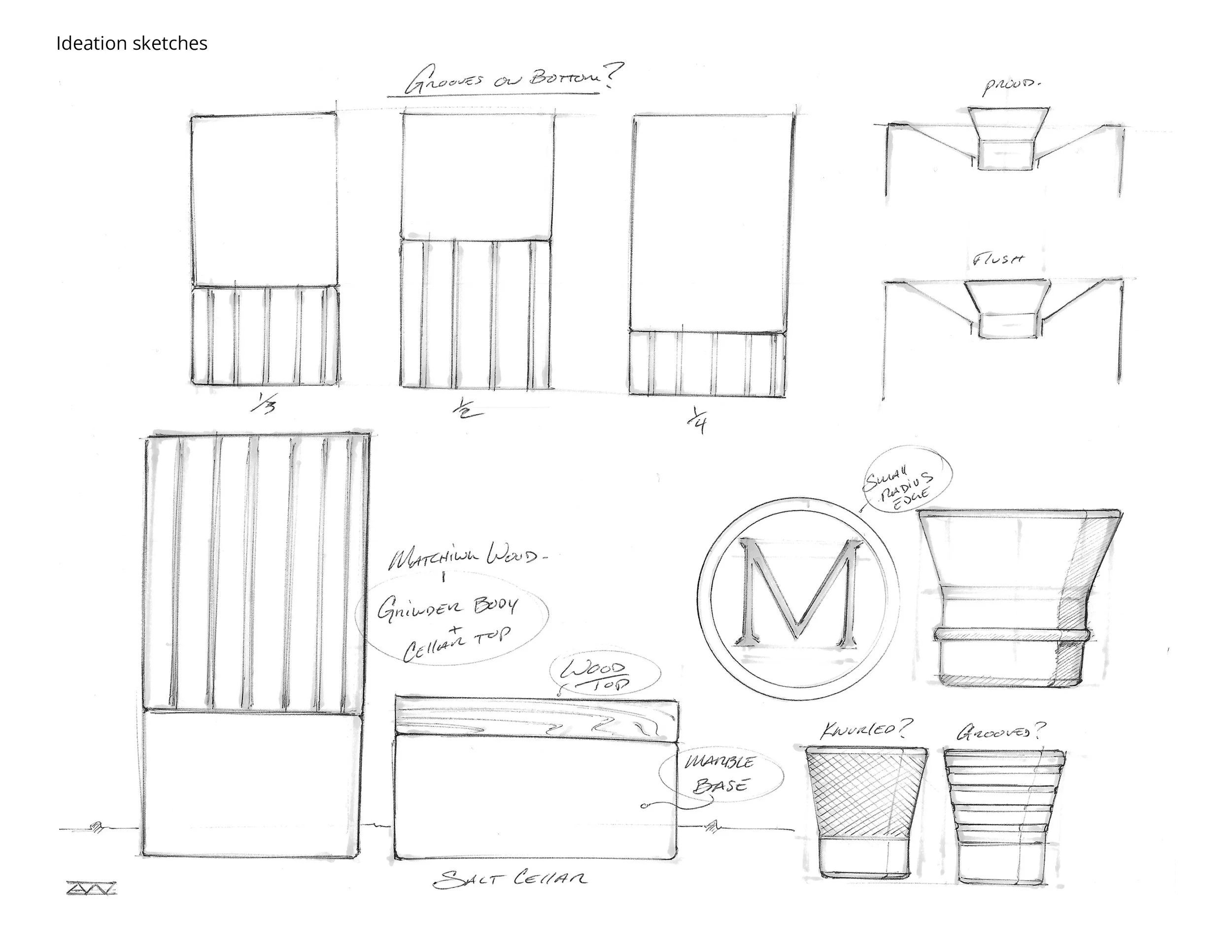
Chengbo Yao’s Object Project started with an instrument he was learning called the Handpan. What started as an observation of the instrument evolved into an exploration of the wavelength 432 Hz, a tuning in sync to the vibrations of nature. Chengbo created musical compositions with his instrument that imitated the sounds of nature like rain, wind, thunder, fog, etc. He then created a record label and website to house his project.
Chengbo Yao Object Project PDF
CORE 1: BOOK
Select your content and begin to source the text and research imagery you will use for your book. Create a Book Plan that outlines your 150+ page book into sections. Design 1/4 of your book, or about 30 pages total. Sketch or place designed pages in your book plan throughout the project to chart your progress and fill in any holes.
CORE 2: MAGAZINE
Select your content and begin to source the text and research imagery you will use for your magazine. Create three nameplates or variants that we can evaluate. Design one 3-spread article using your sourced content. Create a Book Plan that outlines your magazine’s sections and stories. Sketch or place designed pages in your book plan throughout the project to chart your progress and fill in any holes.
CORE 3: BRAND or PACKAGED GOOD
Start to actually design the details of your project. Create a mockup schematic of your packaged good. If applicable, show us front, side, top and back views. This can be 3D rendered or sketched. Research manufacturing and see if this is something you can source or create yourself. Design the packaging that will house your good.
READING
Read the essay “What Design Means For Me” by Karel Martens. In this personal reflection, Karel explains his point of view on design. This is refreshing, especially in context to all the other readings from the year.
EXAMPLE PROJECT
Chengbo Yao’s Object Project started with an instrument he was learning called the Handpan. What started as an observation of the instrument evolved into an exploration of the wavelength 432 Hz, a tuning in sync to the vibrations of nature. Chengbo created musical compositions with his instrument that imitated the sounds of nature like rain, wind, thunder, fog, etc. He then created a record label and website to house his project.
Chengbo Yao Object Project PDF
Week 11: 4/2/24
Object Project: Authored Content
Object Project: Authored Content
Similar to Week 9: Formalize, create a presentation that outlines how you will approach your authored content. Authored content can mean a variety of things, but the point is to generate the text or imagery yourself. Create a presentation and upload to Drive. Go through the motions of creating your authored content, and show us examples of it’s progress in your presentation.
The focus this week is your authored content, but that doesn’t mean to pause on the design of your core component. Keep working on your book, magazine or brand. Print a sample of your work so we can see your progress and discuss if necessary (see below).
CORE 1: BOOK
Create a 3-5 slide presentation that outlines your approach to your authored content and upload to Drive. This can be many things: a photo essay, interview, creating artwork, etc. Explain your plan and show a moodboard or references. Design ½ of your book, or 75 pages. Print 10 of those pages for presentation.
CORE 2: MAGAZINE
Create a 3-5 slide presentation that outlines your approach to your authored content and upload to Drive. This can be many things: a photo essay, interview, creating artwork, etc. Explain your plan and show a moodboard or references. Design ½ of your magazine. Print 6 of those pages for presentation.
CORE 3: BRAND or PACKAGED GOOD
Create a 3-5 slide presentation that defines your system into a kit of parts: Logo, wordmark, typography, color palette, etc. and upload to Drive. Collect 15 images of product photography art direction and inspiration. Print example labels or packaging, etc. at actual size. Make progress in manufacturing or resourcing your good. Bring sourced samples so we can discuss materiality.

The Baffler Magazine has a section called “The Exhibit” where they work with a different artist to create a narrative “op-art” piece surrounding the issue’s theme. Some favorites have been Gilles de Brock, Gender Fail, Jenny Odell, Paul Sahre, Félix Decombat, Ruben Pater and John Provencher.

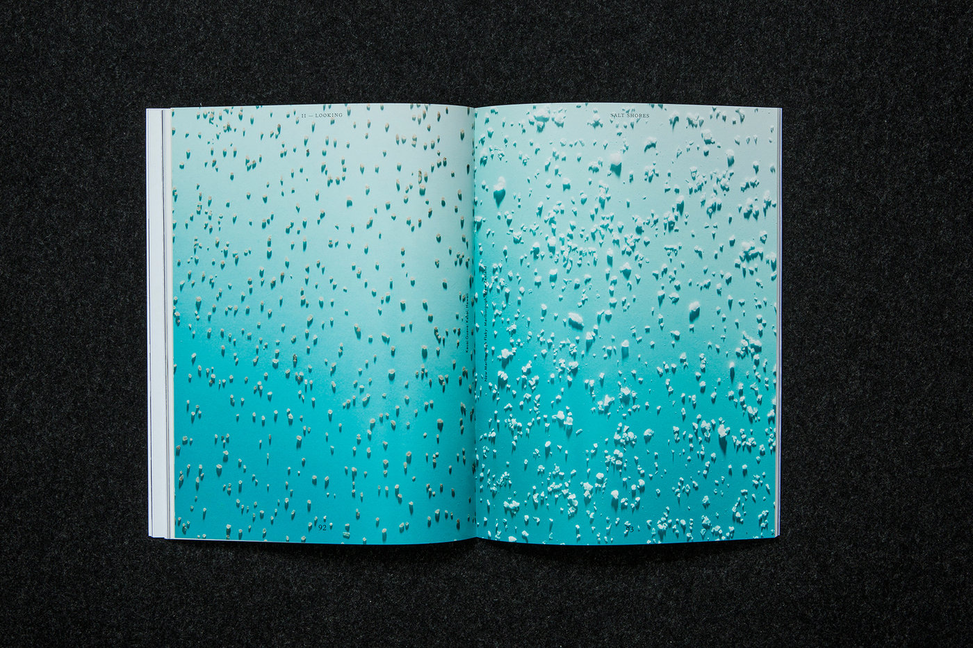
WAX Magazine was a bi-annual print publication exploring the intersection of art, culture and surfing. Each issue is organized around a unique theme and shares the stories of area surfers who are also artists, designers, authors and auteurs. Its first issue was funded in 2011. Its last issue was in 2017. A favorite photo essay was one on the various types of salt found in different oceans by Luke Stettner.

Riposte Magazine profiles bold and fascinating women who challenge power structures and stereotypes. Their interviews candidly discuss their successes & failures, their work, their passions and perspectives.

Peter Buchanan-Smith created Best Made Company, a brand that takes an artists approach to necessary goods. The brand started with an axe, and evolved to goods and clothing among other items. The emphasis here is a clear mission and tone for the company.
The focus this week is your authored content, but that doesn’t mean to pause on the design of your core component. Keep working on your book, magazine or brand. Print a sample of your work so we can see your progress and discuss if necessary (see below).
CORE 1: BOOK
Create a 3-5 slide presentation that outlines your approach to your authored content and upload to Drive. This can be many things: a photo essay, interview, creating artwork, etc. Explain your plan and show a moodboard or references. Design ½ of your book, or 75 pages. Print 10 of those pages for presentation.
CORE 2: MAGAZINE
Create a 3-5 slide presentation that outlines your approach to your authored content and upload to Drive. This can be many things: a photo essay, interview, creating artwork, etc. Explain your plan and show a moodboard or references. Design ½ of your magazine. Print 6 of those pages for presentation.
CORE 3: BRAND or PACKAGED GOOD
Create a 3-5 slide presentation that defines your system into a kit of parts: Logo, wordmark, typography, color palette, etc. and upload to Drive. Collect 15 images of product photography art direction and inspiration. Print example labels or packaging, etc. at actual size. Make progress in manufacturing or resourcing your good. Bring sourced samples so we can discuss materiality.
The Baffler Magazine has a section called “The Exhibit” where they work with a different artist to create a narrative “op-art” piece surrounding the issue’s theme. Some favorites have been Gilles de Brock, Gender Fail, Jenny Odell, Paul Sahre, Félix Decombat, Ruben Pater and John Provencher.
WAX Magazine was a bi-annual print publication exploring the intersection of art, culture and surfing. Each issue is organized around a unique theme and shares the stories of area surfers who are also artists, designers, authors and auteurs. Its first issue was funded in 2011. Its last issue was in 2017. A favorite photo essay was one on the various types of salt found in different oceans by Luke Stettner.
Riposte Magazine profiles bold and fascinating women who challenge power structures and stereotypes. Their interviews candidly discuss their successes & failures, their work, their passions and perspectives.
Peter Buchanan-Smith created Best Made Company, a brand that takes an artists approach to necessary goods. The brand started with an axe, and evolved to goods and clothing among other items. The emphasis here is a clear mission and tone for the company.
Week 12: 4/9/24
Object Project: Dummy, Collate
Object Project: Dummy, Collate
Design the entierty of your core component. Create a “dummy” version of your object, exactly full or half scale. We want to spend our time talking about details: how to refine your logo, layout, typography, etc. Use this crit to talk through anything you are questioning about your design system.
Devise a plan for 2 of your 3 “extensions”. Design the first round of your extensions. Show them in their native format or create a 3-5 slide presentation explaining how you will move forward. Review week 9’s assignment for example deliverables. Upload whatever you would like to show to Drive.
CORE 1: BOOK
Design your book from cover to cover. Print a draft version and bind loosely with binder clips. Fill in your Book Plan with all of your designed spreads as thumbnails. We will review typographic details, pacing, structure and discuss finishing details.
CORE 2: MAGAZINE
Design your magazine from cover to cover. Print a draft version and bind loosely with binder clips. Fill in your Book Plan with all of your designed spreads as thumbnails. We will review typographic details, pacing, structure and discuss finishing details. Conceptualize and design the covers of your next two issues.
CORE 3: BRAND or PACKAGED GOOD
Refine your identity system and bring in a prototype version of your final product and it’s packaging. in a 5-10 slide presentation refine your system’s kit of parts including: Logo, wordmark, typography, color palette, etc. Plan a photo shoot or devise a rendering method for final product photography or presentation.
VIDEO
Consider how short or medium form video can play a role in the promotion of your core component. This can take form of a trailer, setting the tone for your magazine. Or think how to leverage social media platforms and the impact of quick, expressive video clips.

MICROSITES
There is no shortage of great microsites, or one page self-contained interactive experiences that promote a publication or event, give a general overview of it’s contents and serve for a place to purchase a copy.
Decade
Kindling Magazine
Nebau Forst Catalog
Klima Magazine
Nosaj Thing – Continua
Island, Island
The Gentlewoman
Uncanny Valley
High School
Pitch Music Festival


Devise a plan for 2 of your 3 “extensions”. Design the first round of your extensions. Show them in their native format or create a 3-5 slide presentation explaining how you will move forward. Review week 9’s assignment for example deliverables. Upload whatever you would like to show to Drive.
CORE 1: BOOK
Design your book from cover to cover. Print a draft version and bind loosely with binder clips. Fill in your Book Plan with all of your designed spreads as thumbnails. We will review typographic details, pacing, structure and discuss finishing details.
CORE 2: MAGAZINE
Design your magazine from cover to cover. Print a draft version and bind loosely with binder clips. Fill in your Book Plan with all of your designed spreads as thumbnails. We will review typographic details, pacing, structure and discuss finishing details. Conceptualize and design the covers of your next two issues.
CORE 3: BRAND or PACKAGED GOOD
Refine your identity system and bring in a prototype version of your final product and it’s packaging. in a 5-10 slide presentation refine your system’s kit of parts including: Logo, wordmark, typography, color palette, etc. Plan a photo shoot or devise a rendering method for final product photography or presentation.
VIDEO
Consider how short or medium form video can play a role in the promotion of your core component. This can take form of a trailer, setting the tone for your magazine. Or think how to leverage social media platforms and the impact of quick, expressive video clips.
MICROSITES
There is no shortage of great microsites, or one page self-contained interactive experiences that promote a publication or event, give a general overview of it’s contents and serve for a place to purchase a copy.
Decade
Kindling Magazine
Nebau Forst Catalog
Klima Magazine
Nosaj Thing – Continua
Island, Island
The Gentlewoman
Uncanny Valley
High School
Pitch Music Festival
✳ Week 13: 4/16/24
Object Project: Final
Object Project: Final
Produce your final project core component, either your book, issue 1 of your magazine, or your packaged good. These should be real, physical, tangible objects. Continue to design your three extensions in the background of this deliverable.


Example Extension: Event & Promotion
Hilda Wong created The Internet is my Main Course, a curated dinner party series and short film of the same title. The film was looped in the background of the event. A series of Instagram posts acted as an invitation and documentation of the event.
Example Extension: Event & Promotion
Hilda Wong created The Internet is my Main Course, a curated dinner party series and short film of the same title. The film was looped in the background of the event. A series of Instagram posts acted as an invitation and documentation of the event.
Week 14: 4/23/24
Object Project: Presentation Draft, Office Hours
Object Project: Presentation Draft, Office Hours
Class is optional, finish and hand in your portfolio on time. Upload your PDF, go hang out in the park, take a breath. If you’d like to discuss your Research & Identity project or extensions you can sign up for a one-on-one session.
Week 15: 4/30/24
Object Project: Final Presentation & Party 🎉
Object Project: Final Presentation & Party 🎉
Create a 2-minute presentation for our guest which showcases your project as a whole. Describe your process from beginning to end, starting with what you found fascinating about your object and how it manifested into your final project. Think of this as a full case study, walking through your process from concept, to visual language and finally execution. Finish your three extensions and include them in your presentation. Upload to Google Drive. Please create a new folder with your name as the title and upload all of your assets, extensions, and presentation PDF.
It goes without saying, but your end result should be professional and polished. Have your presentation ready and bring in your final core component. We will organize the room to display all of your projects and review with the guest. We will hold class at No Ideas, and presentations will start promptly at 4:00pm. Be on time and prepared.
DESCRIBE
1. What was your object?
2. How did you uncover your theme?
3. How did it manifest in your projects?
4. Finally, show your projects in full as a case study
— Organize this section like an Identity Guidelines doc
a. Intro / concept
b. Logo
c. Wordmark
d. Typography (primary, secondary...)
e. Color Palette
f. Art Direction / Photo Style
g. Iconography
h. Your Three Extensions
ALSO
Please upload a PDF of all of your work from Fall and Spring semester for grading purposes to Google Drive by Friday 4/26. This should be a simple PDF well presented that shows me your final project outcomes. Please create a new folder with your name as the title. Please label your file "Your_Name_TypeDesign23-24.pdf".

READING
There are countless examples of great identity guidelines programs going back to their inception with modernist design and the international typographic style. Standards is a platform for digital versions of identity guidelines documents. See examples on their site for how these types of guidelines are designed and organized. Link
It goes without saying, but your end result should be professional and polished. Have your presentation ready and bring in your final core component. We will organize the room to display all of your projects and review with the guest. We will hold class at No Ideas, and presentations will start promptly at 4:00pm. Be on time and prepared.
DESCRIBE
1. What was your object?
2. How did you uncover your theme?
3. How did it manifest in your projects?
4. Finally, show your projects in full as a case study
— Organize this section like an Identity Guidelines doc
a. Intro / concept
b. Logo
c. Wordmark
d. Typography (primary, secondary...)
e. Color Palette
f. Art Direction / Photo Style
g. Iconography
h. Your Three Extensions
ALSO
Please upload a PDF of all of your work from Fall and Spring semester for grading purposes to Google Drive by Friday 4/26. This should be a simple PDF well presented that shows me your final project outcomes. Please create a new folder with your name as the title. Please label your file "Your_Name_TypeDesign23-24.pdf".
READING
There are countless examples of great identity guidelines programs going back to their inception with modernist design and the international typographic style. Standards is a platform for digital versions of identity guidelines documents. See examples on their site for how these types of guidelines are designed and organized. Link